Project type
Self-directed
Role
Graphic design
Time frame
5 months
Year
2022
Overview
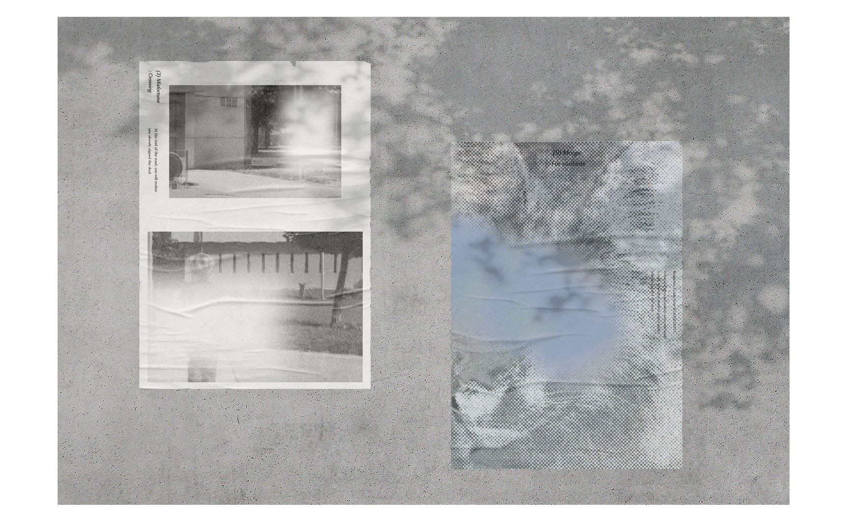
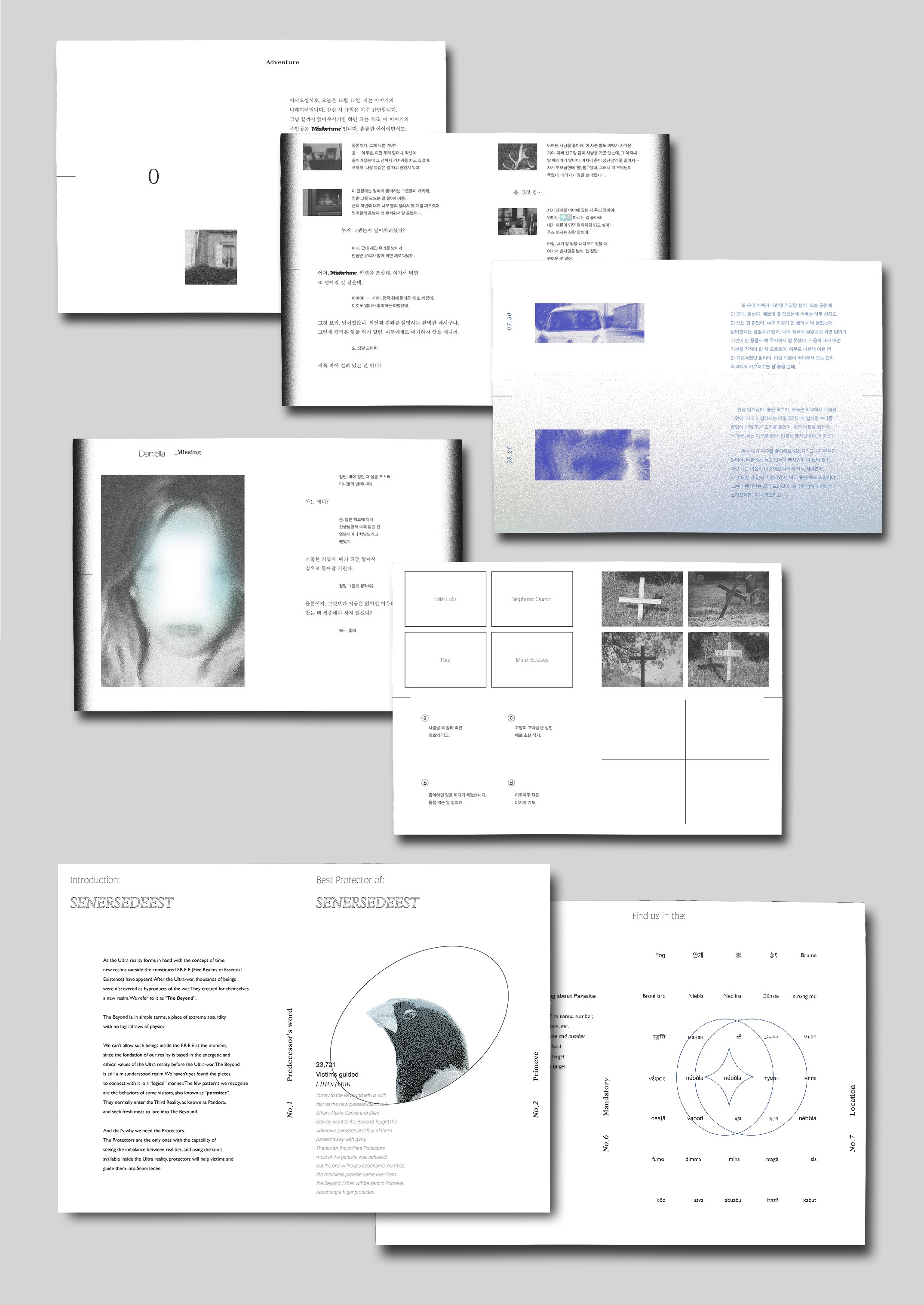
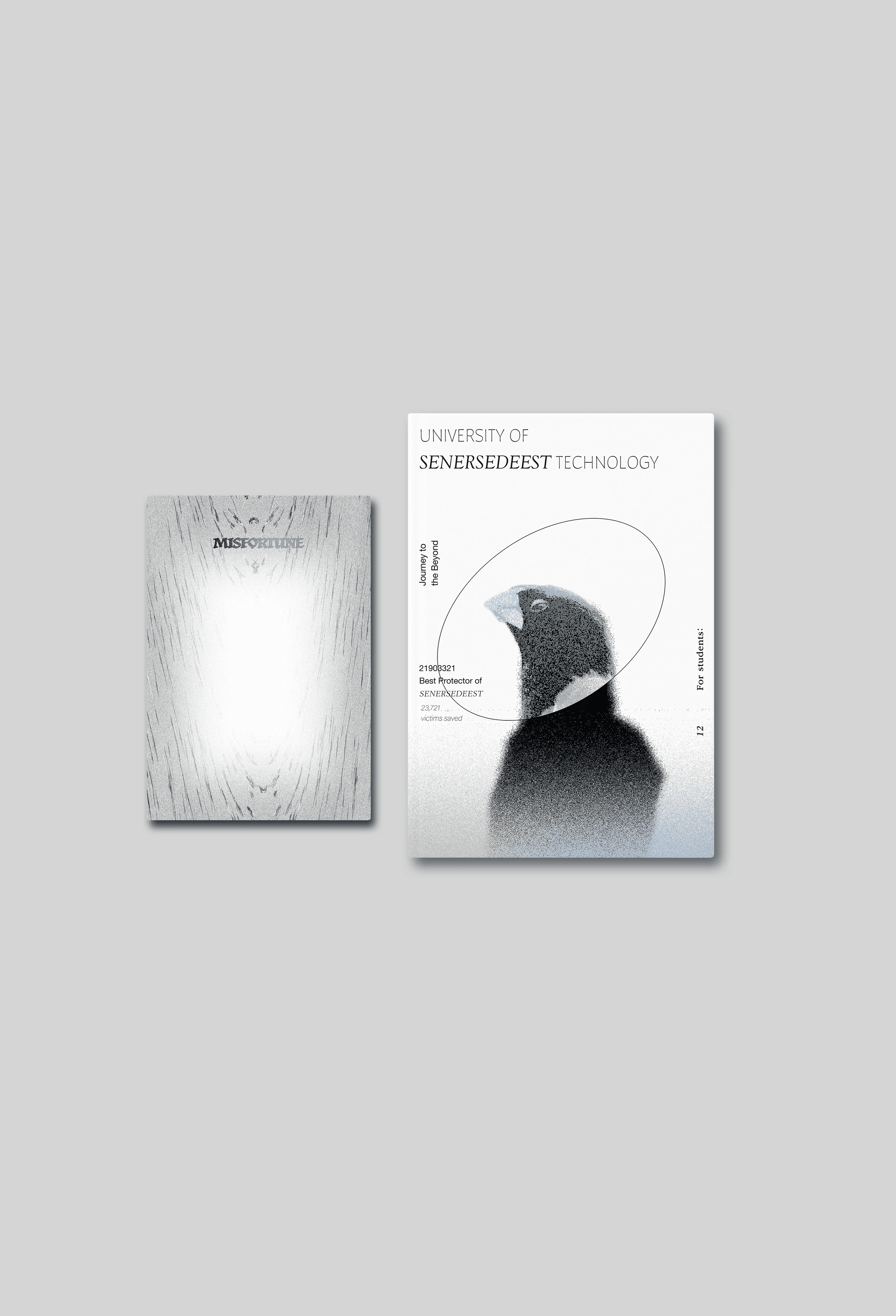
Misfortune consists of a 156 page storybook, a supplementary booklet focusing on one of the game's contents, and an A2-sized poster.
"Little Misfortune" is an interactive story game with a whimsical dialogue and fairy-tale-like illustrations, but it addresses various social issues affecting children within its charming visuals.
Starting with the question, 'What if this game were a novel?', I focused on the content rather than the graphics to emphasize the dismal, grim subject insinuated in the dialogue. Using InDesign, I considered the mood conveyed by different typefaces, the weight of the bulk of clustered texts, and even the whitespace on the paper while making the layout.
Concept
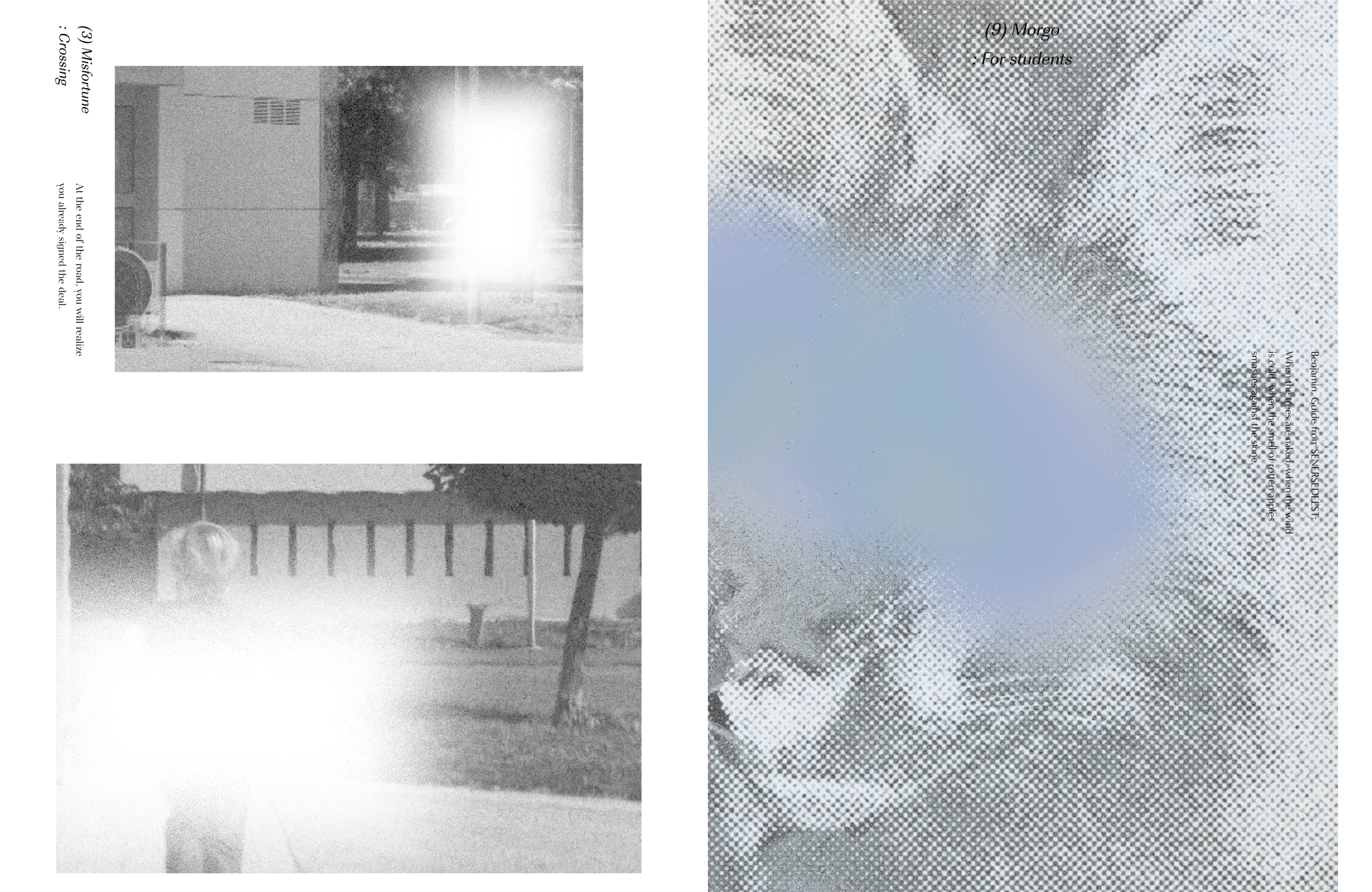
The graphic elements in the project include three effects used in the game: sparkle, glitch, and a fading-out effect in white. I selected and edited the images to align with the story's progression.
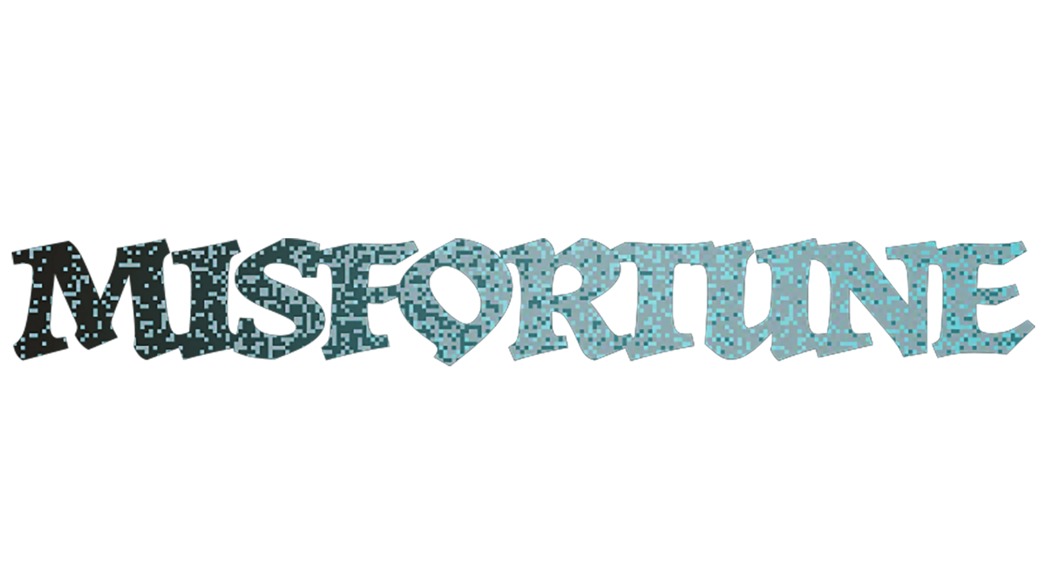
For the typefaces, I've chosen a sans-serif font for a modern, clean style, and used a bold, serif font to give an unorthodox, distinct ambience. Additionally, to make it look like a sparkle, I used a monochromatic palette with a base of black and white, incorporating shades of turquoise, blue, and other tones in a similar colour scheme.


