Project type
Buddylabs
Role
UX/UI, Web design
Time frame
12 Weeks
Year
2023
Overview
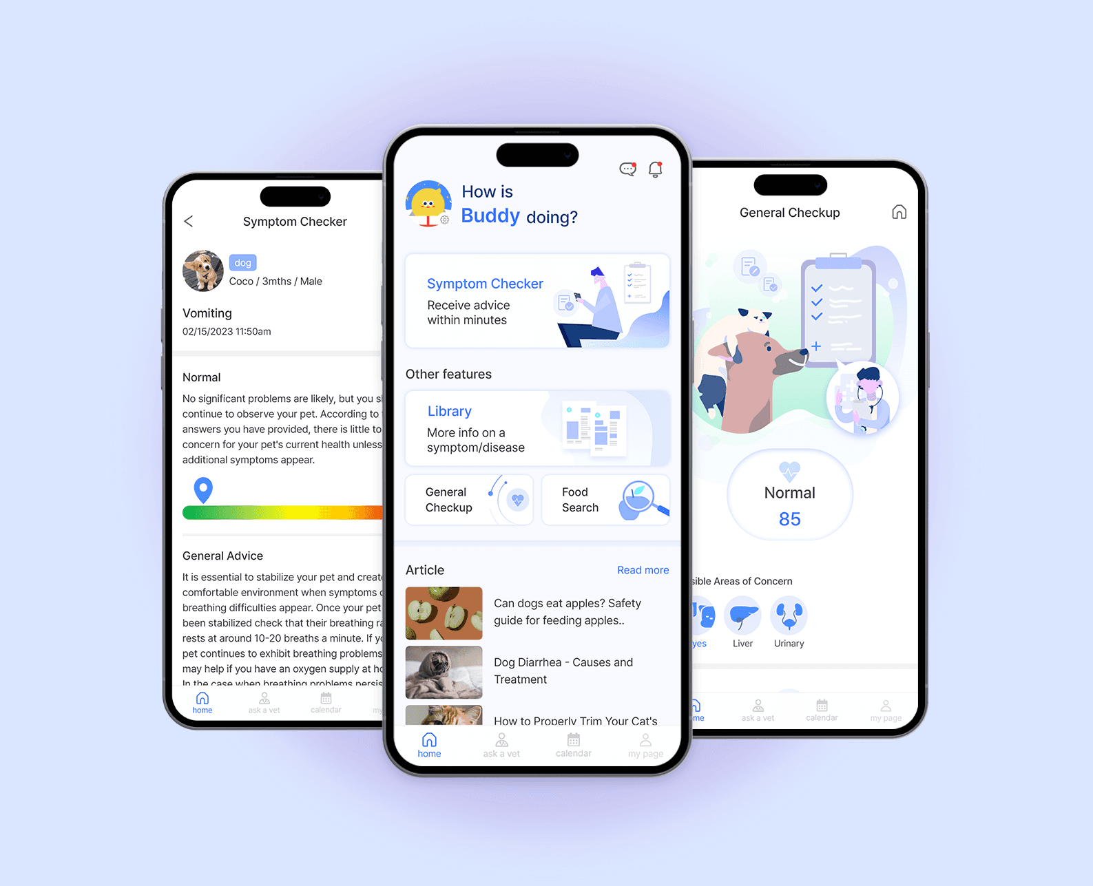
Buddydoc redesign :
Buddydoc was aimed at the U.S., where telemedicine was legal and the pet-related industry had a high market share at the time of its first launch. As the project progressed, our team launched it in Korea, where the pet market is large and can quickly collect and reflect user responses since the company has an office in Korea.
As a sole designer, I was responsible for designing the UI for both Android and IOS, images for ASO, graphics, ads, an additional touch of the web, etc. that needed some visual touch. During my time at Buddylabs, a start-up working with a dev-oriented company called People in Soft, I started working on this project immediately after I joined the team in July 2022.
The goal of our new team was to uphold some basic ideas whilst making a new structure to match the concept of our project and upcoming features.
View project on Product Hunt
https://www.producthunt.com/products/buddydoc#buddydoc-2
Problem analysis
After its first release of Buddydoc, it was necessary to establish a different tone and manner that matches Buddydoc's mission, "the first step before the vet."
In the first discussion for user experience, they picked up three main keywords 'Pet parent', 'Pet care' and 'Veterinary service' and the original design wasn't effectively conflating the keywords with it.
Also, the initial design style was aimed at a more higher age bracket than it was meant to be, making the design stick to a rudimentary style and system.
Redesign milestones
To resolve this problem; redesigning the style and target/user experience issues, our team were able to identify included:
Re-establish target user and demand - Quantitative research
A new wireframe that meets the new functions - Our team underlined some features that might help to increase user retention and highlight the frequently used features, organising the structures to allow the users to quickly familiarise themselves with the interface and find information easily.
Create a new visual style, change of typeface, etc.
Quantitative research
To re-establish the target users for redesign work, our team researched to check the age of the users who are actively using Buddydoc.
In the initial discussion, the age bracket was above 40s. This result was a response to match the keywords instead of doing it the other way around, so the actual users and the targeted users didn't match.
We made a survey that included questions asking information that's not overly personal, like their age and if they're the only pet parent in their household.
With this process, our team could get an intelligibility over what the main features are and whom to aim as a main target.

Key features
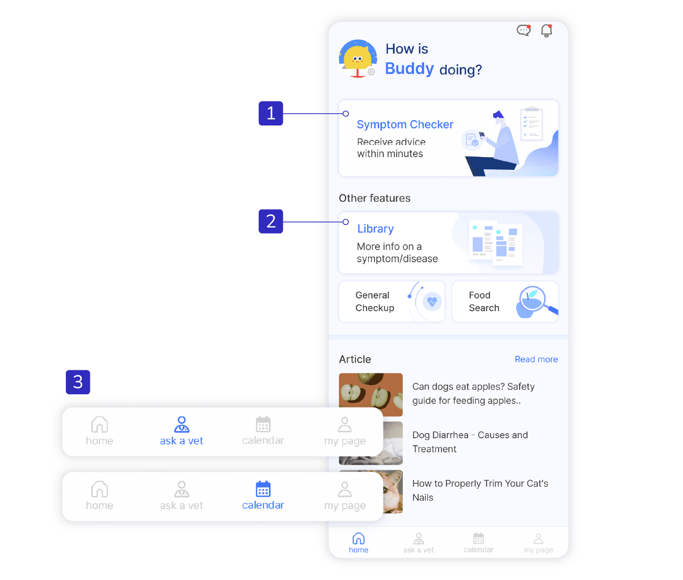
1. Symptom Checker
The Buddydoc dog and cat symptom checker is the main feature that can evaluate over 150 common pet symptoms with immediate results.
Library
Users can learn about their pet's symptoms and what they mean. Information on causes, risks, prevention tips and more.
Ask a Vet/Calendar
These two features are to increase the retention rate. Buddydoc symptom checker can only be used when users find something that might be a sign of an illness. So with these two features, users can write and manage their pet's vaccination schedule, daily records, and get personalised advice from a reliable, professional vet.
Solving structure problems

Initial structure
1. Margins : 17
2. Gutters/Horizontal : 12, Vertical : 7
Matching the margins and gutters that could be measured in increments of 2pt(dp) or 4pt(dp) was the first thing to change throughout the redesigning process.
Giving accessibility and readability by making the graphics and cards in their most efficient place and order within the touch areas was also needed.
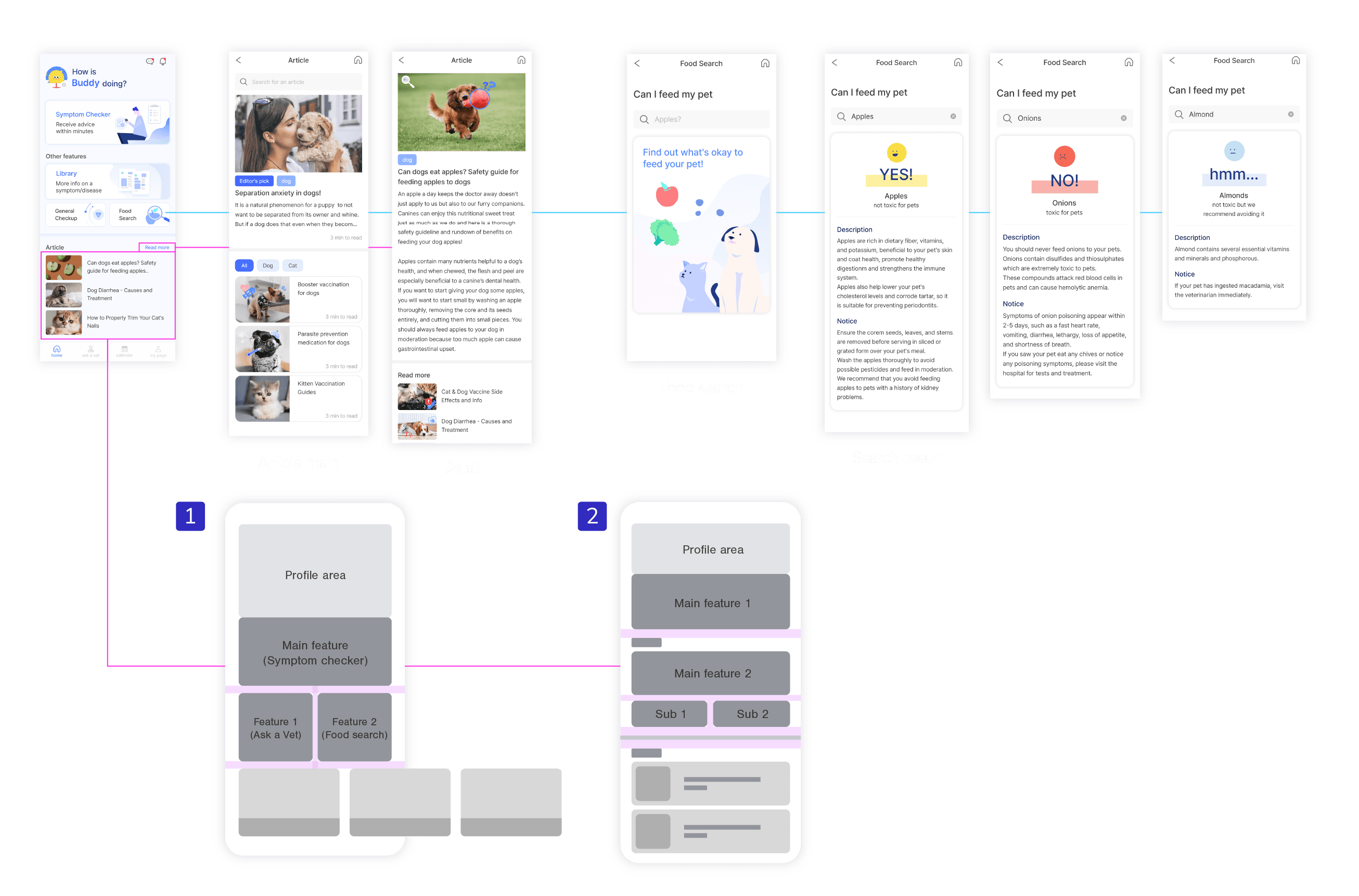
Redesigning structure
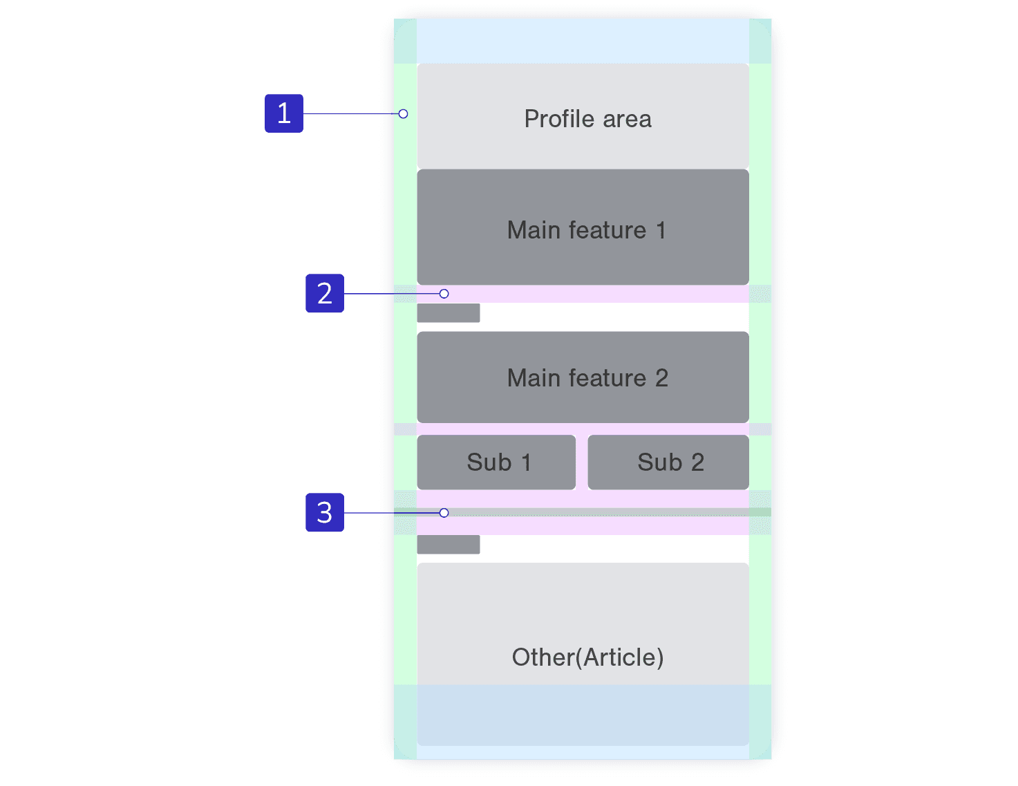
1. Margins : 16
2. Gutters/Horizontal : 20, Between 'Main feature' card and 'Sub 1', Vertical : 12
After changing the margins, I've adjusted the size of each section and card. For instance, 'profile area' is more like welcoming users with a unilateral, personalised message. So it doesn't need to take up much space like the initial structure.
To give simplicity for users to make them easily navigate the functions they need, I've made a card with a concise description. The functions of Buddydoc are directly leading users to search and examine, so it needs to have a clear visual hierarchy showing what each function is.
Workflow
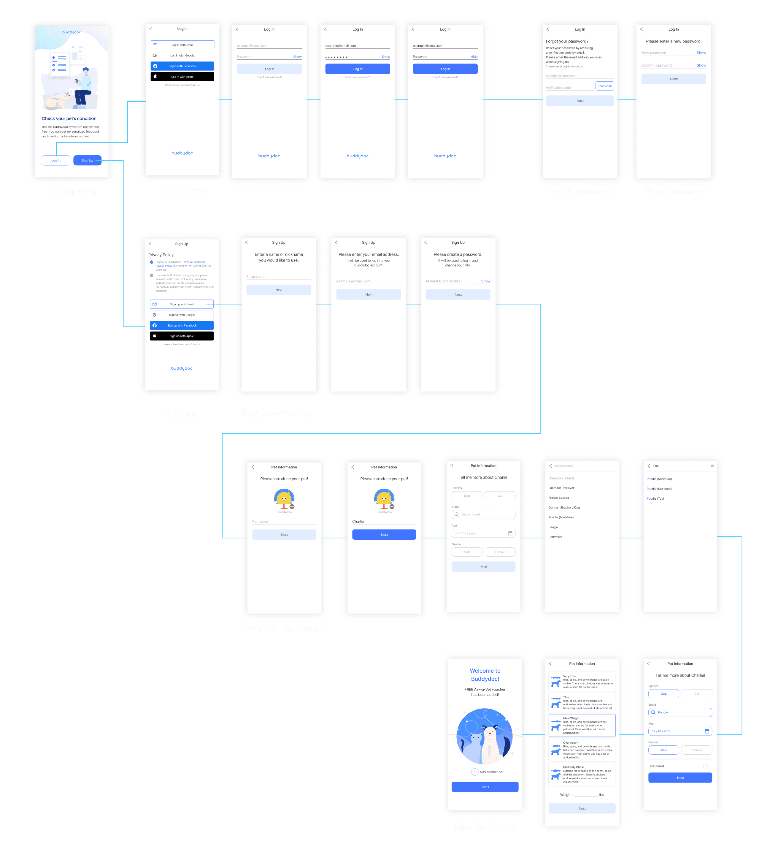
After getting feedback on the wireframe variations, I developed one wireframe and branched it into a design with several details. The main focus was to reduce the lines in the login screen, user information and pet information screens and give intelligibility so that users could easily sign up through clear steps.
Additionally, I added the onboarding screen to visually show the user two actions (login, sign up) after installing/reinstalling the app, and provide a simple explanation of Buddydoc's functions.

Onboarding to Home screen
I tried to reduce the steps of pet information input, which took more than three steps in the previous design, to two steps, saving users the trouble of going back and forth to the previous step to check the information they entered.
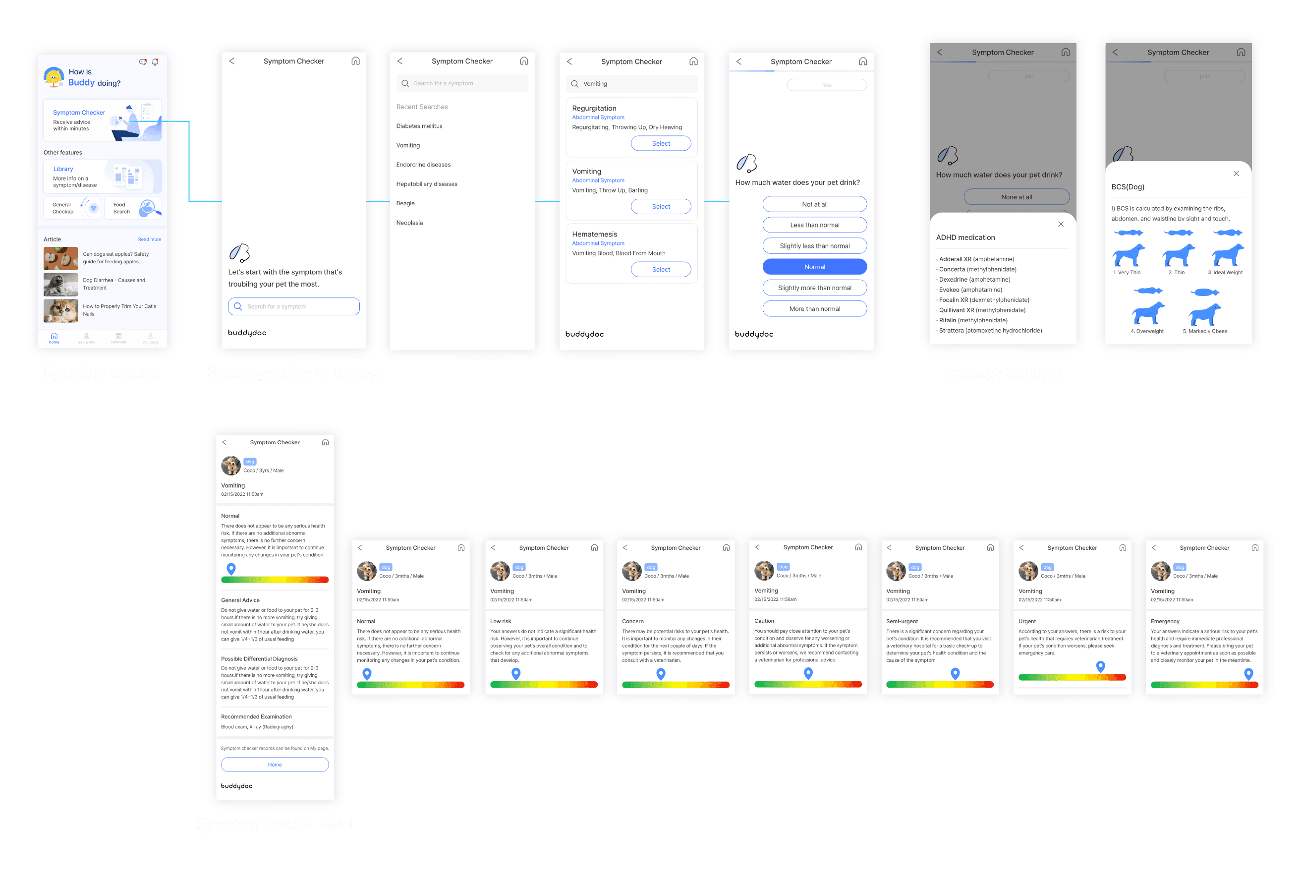
Symptom Checker
The key point in redesigning the symptom checker was to enable users to immediately find and select what they are searching for through a design with consistency and simplicity. So I first changed the search bar, which was just an underline in the previous design, to a box shape to match the buttons(select/search/etc.) used in the app.
To use the symptom checker, users first need to enter their pet's specific disease name, or symptoms such as vomiting, itching, or circling the same spot and it will automatically show the results closest to that under the search bar. Each disease and symptom automatically shows the most related ones, based on a database of words searched similarly by the users.
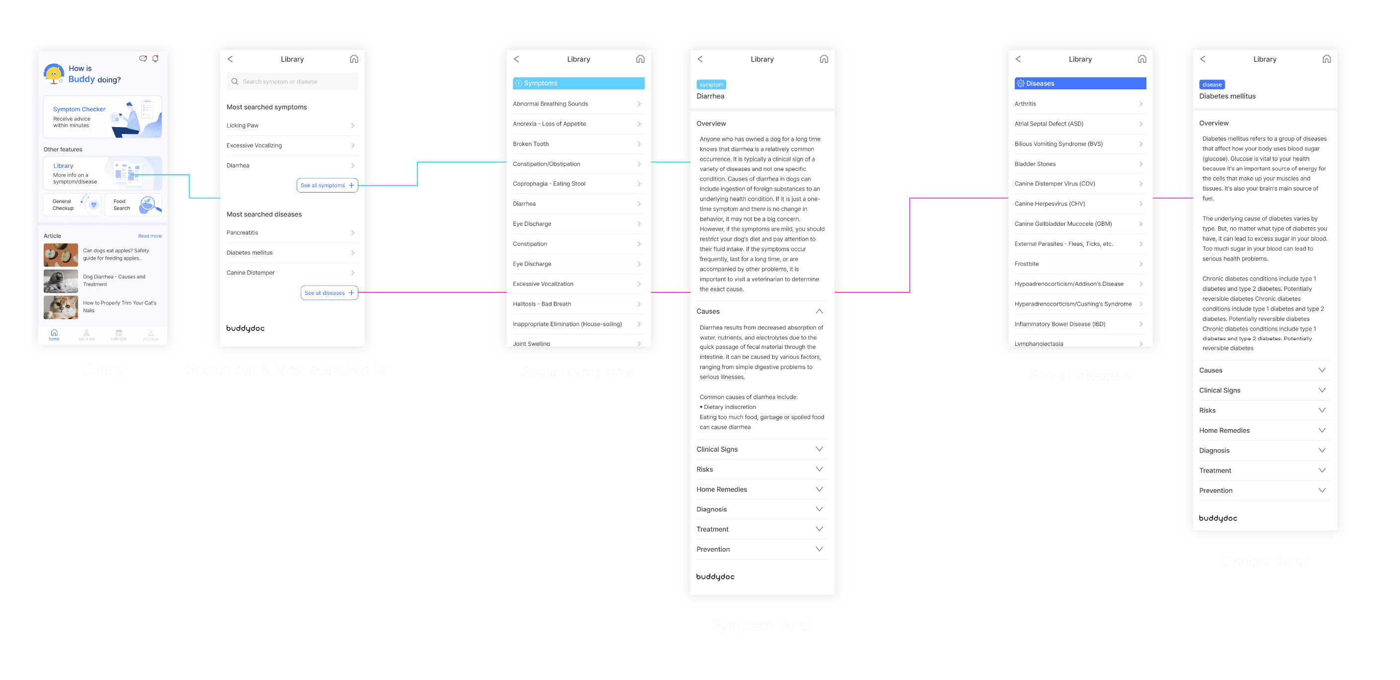
New Function - Symptom & Disease Library
Buddydoc library is an archive where you can check all diseases and symptoms, including the most searched ones on Buddy Doc. Instead of having to search for each symptom one by one, you can see causes, main symptoms, treatments that can be done at home, prevention, and the diagnosis that a veterinarian can generally make at a glance.
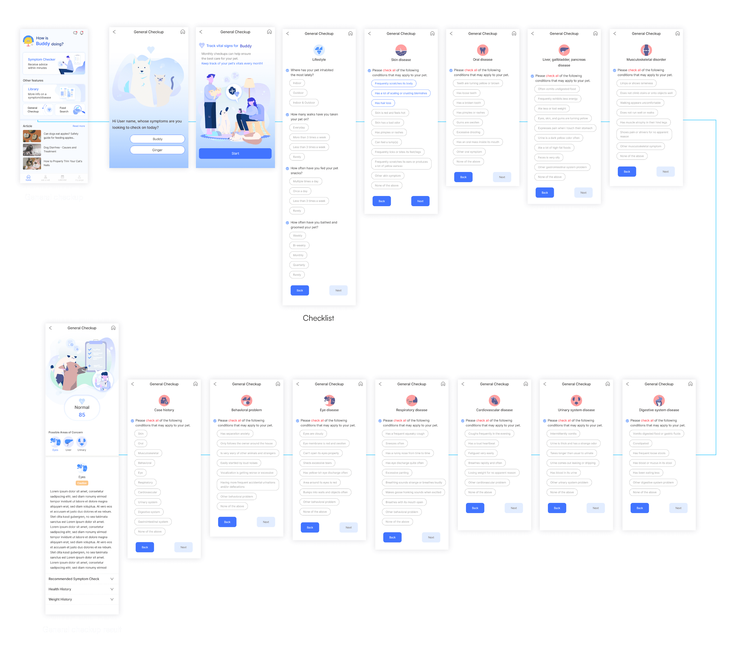
New Function - General Checkup
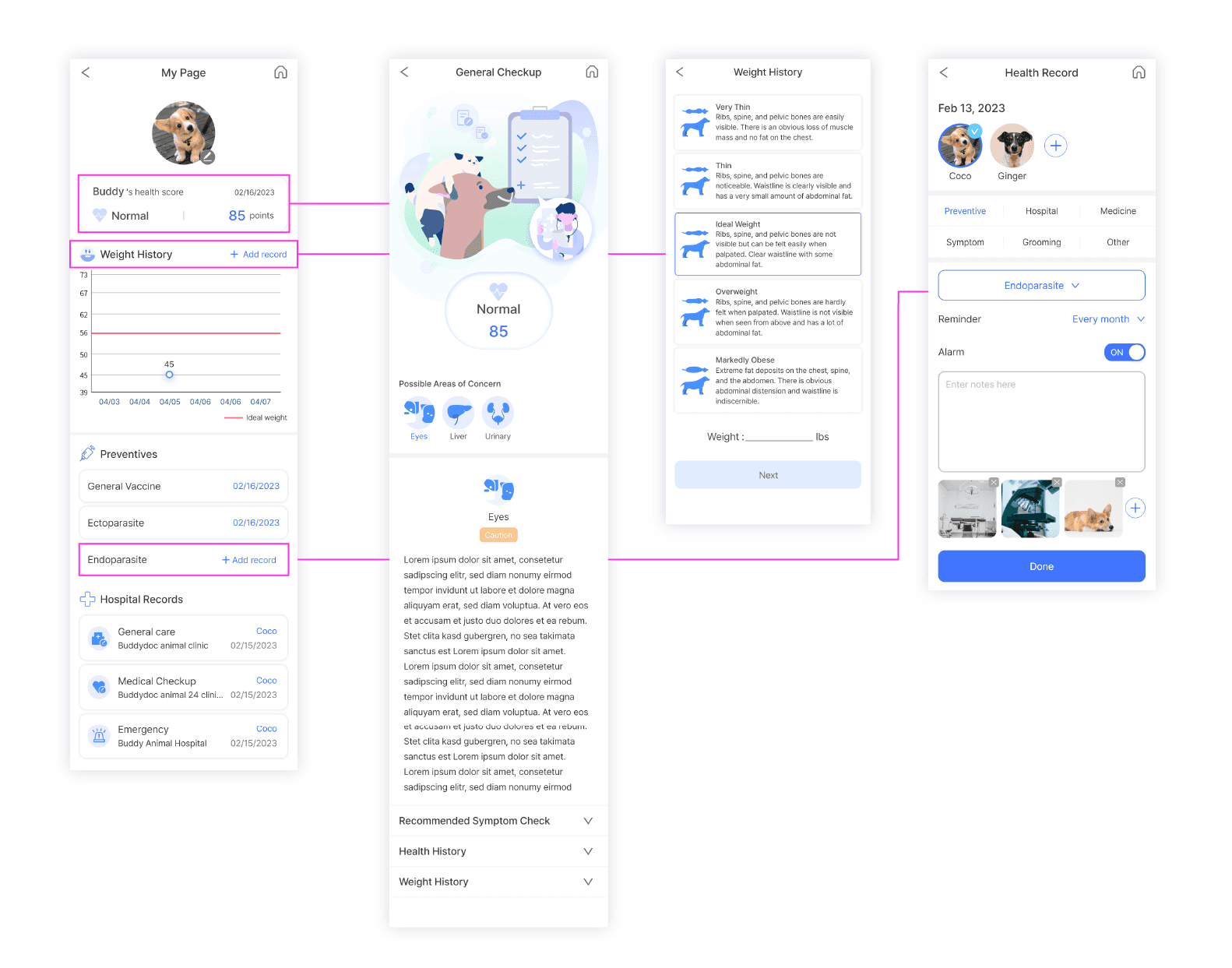
Buddydoc general checkup, along with its primary function symptom checker, allows users to thoroughly monitor their pet's health. Through a monthly notification and checkup, users can record and assess their pet's well-being, identifying potential risk factors even in the absence of specific symptoms. I have designed graphic icons that match each category to make it easy for users to identify any areas of concern on the result page.
Article, Food Search
Buddydoc article provides more insights about pet health and lifestyle, while the Food Search feature offers nutritional information, feeding methods, and foods suitable for pets. These two features are aimed at increasing user retention. So without altering the overall framework, I made some changes to the graphic elements to capture the user's attention and give consistency.
Tab bar sections
The button-style sections on the home screen are a type of check-result page and archives that can be processed on a single structure that doesn't need many steps to branch out to a different wireframe, clearly navigating for users to easily find the content they're looking for, so the interactions are mostly unilateral. While the features in the tab bar can give personalised results and have much higher user engagement.
Ask a Vet
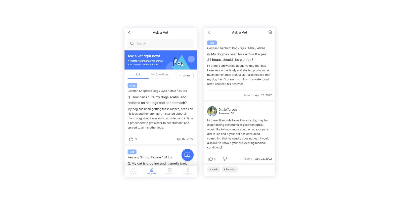
Buddydoc Ask a Vet is a veterinary forum. Users can ask and check out other personal questions about their pets. With Ask a Vet, they can quickly receive answers from reliable veterinarians.
Users can leave two additional questions in response to a veterinarian's answer, allowing them to view answers to the original question and follow-up questions in one screen, in a row. Moreover, if photos of pets attached by users are classified as sensitive content, such as surgical sites or bloodstains, they will be blurred with a graphic content warning after our team checks through Buddydoc admin web.
Calendar
The calendar is designed for users to record everything from their pets' health to activities. It primarily helps to remind users of long-term or recurring events that need to be checked, such as important veterinary appointments, medication times, and vaccination schedules. Each event added to the calendar will send push notifications to users.
Health records are broadly categorized into preventive care, hospital visits, medication, symptoms requiring further attention, grooming, and other records. In the previous design, all categories and subcategories were designed as buttons, making it visually cluttered and unnecessarily elongating the screen. So during the redesign, I made the choices for each category appear as a popup fixed to the bottom of the screen, facilitating a smooth downward flow from choosing the category, writing down the details and to the 'done' button.
Additionally, a simple guide screen showing the user how to navigate the calendar timeline has been added to give users concise information on how to use the Calendar.

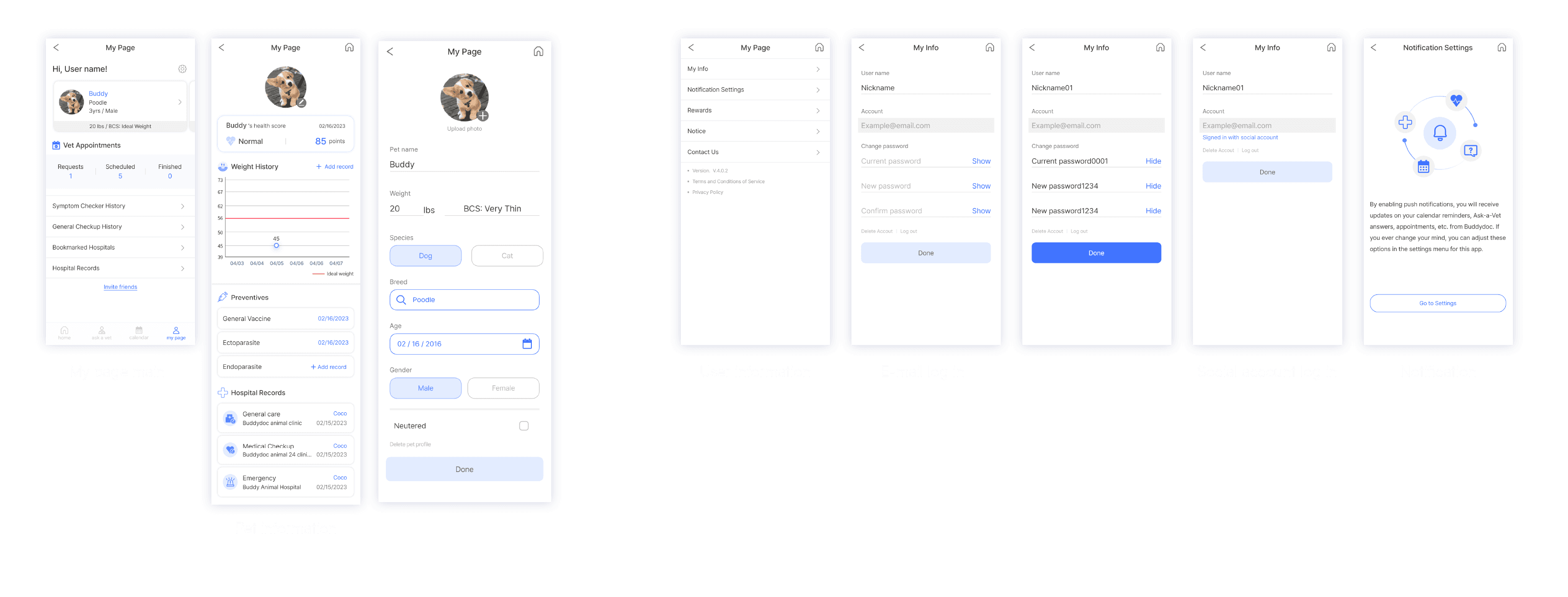
My page
On My page, users can check their pet's profile, user profile, and the recent result of general checkup. Pet information includes newly added general checkup, weight history, and health record results from the calendar.
Previously it only had pet information but through meetings with the developers, our team has integrated new features into My page, making a link with General checkup results and preventives from the Calendar to encourage users to use Buddydoc more frequently.
Buddydoc Korean
After the Korean launch of Buddydoc, we added two features exclusively to the Korean app, nearby hospital and allergy test, to expand our service. Given that our team was based in Seoul, it was beneficial to target the Korean market to obtain user experience easily and get immediate results for the ads.
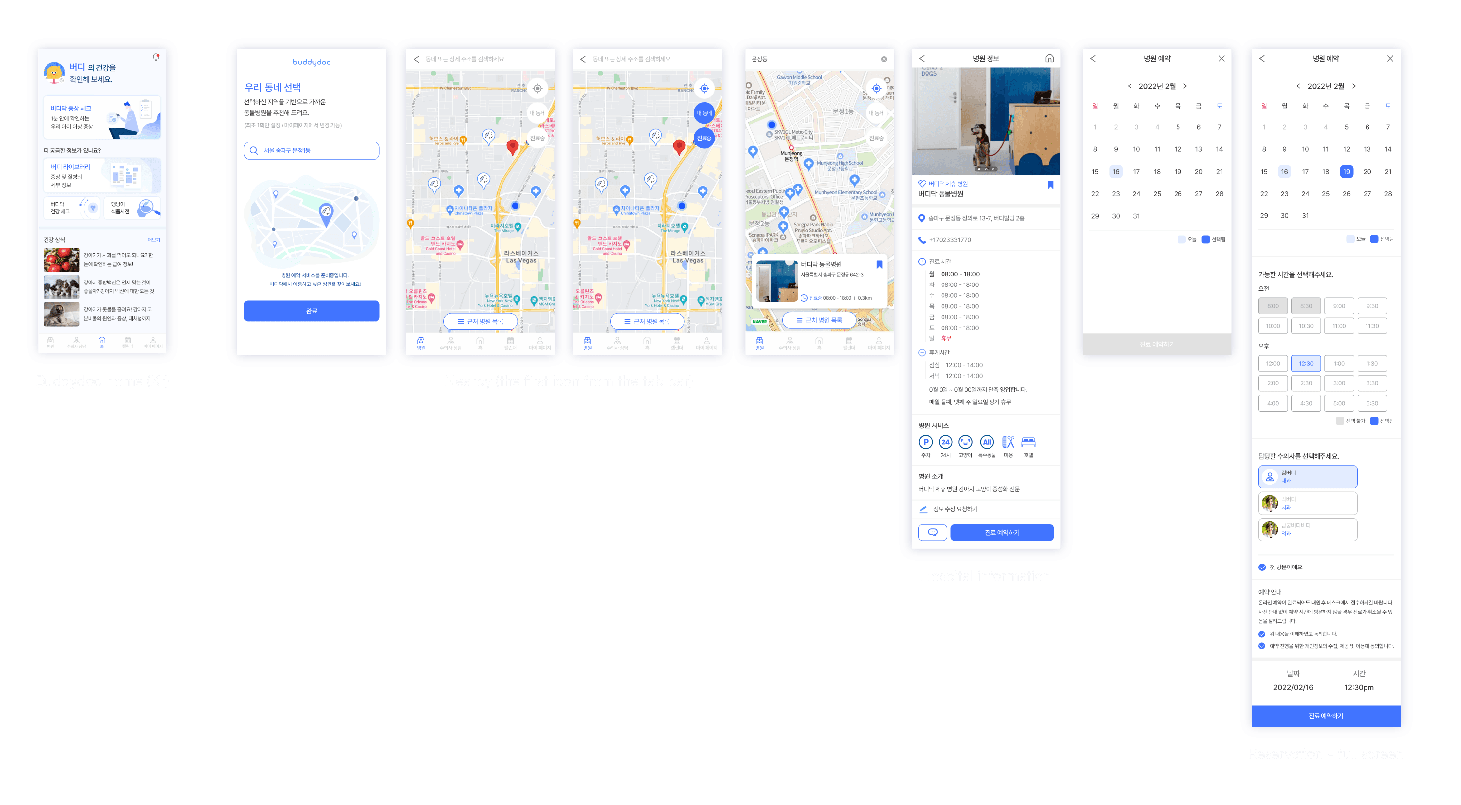
After the meeting, our team made a hospital(nearby) section in the tab bar, affiliating with animal hospitals in Korea to create a flow where users can check their pets' health within the app and immediately book nearby hospitals.
I've completed the design of the allergy test, which is still in progress in dev.
Nearby
Nearby(translated in English, in Korean: 병원) is primarily focused on finding hospitals near the user's location, searching for hospitals near the user's neighbourhood, and finding currently open hospitals.
Users can choose their neighbourhood, explore nearby hospitals, bookmark hospitals, or send partnership requests to Buddydoc for a specific hospital. For this work, I have come up with ideas for the entire flow and made the design and components for every screen.
Allergy test
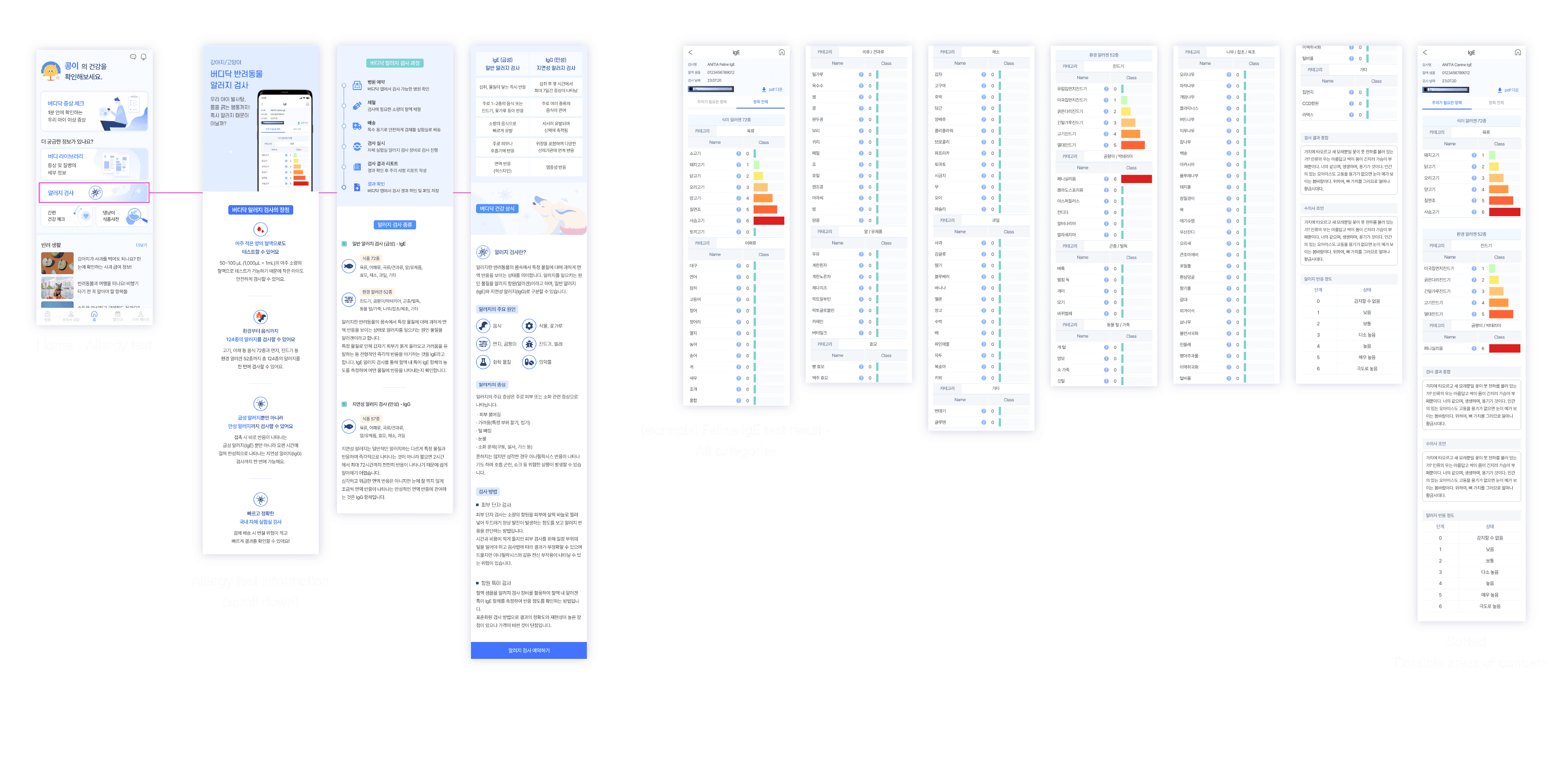
I designed the graphics to illustrate the types and information of the allergy test. Allergy tests are planned to be conducted in collaboration with specialized institutions, and the results will be delivered to the app through the Buddydoc admin page. I organized and designed up to 72 categories on the results page to fit the app screen, allowing users to distinguish between all categories and possible areas of concern.
Buddydoc home (kr)
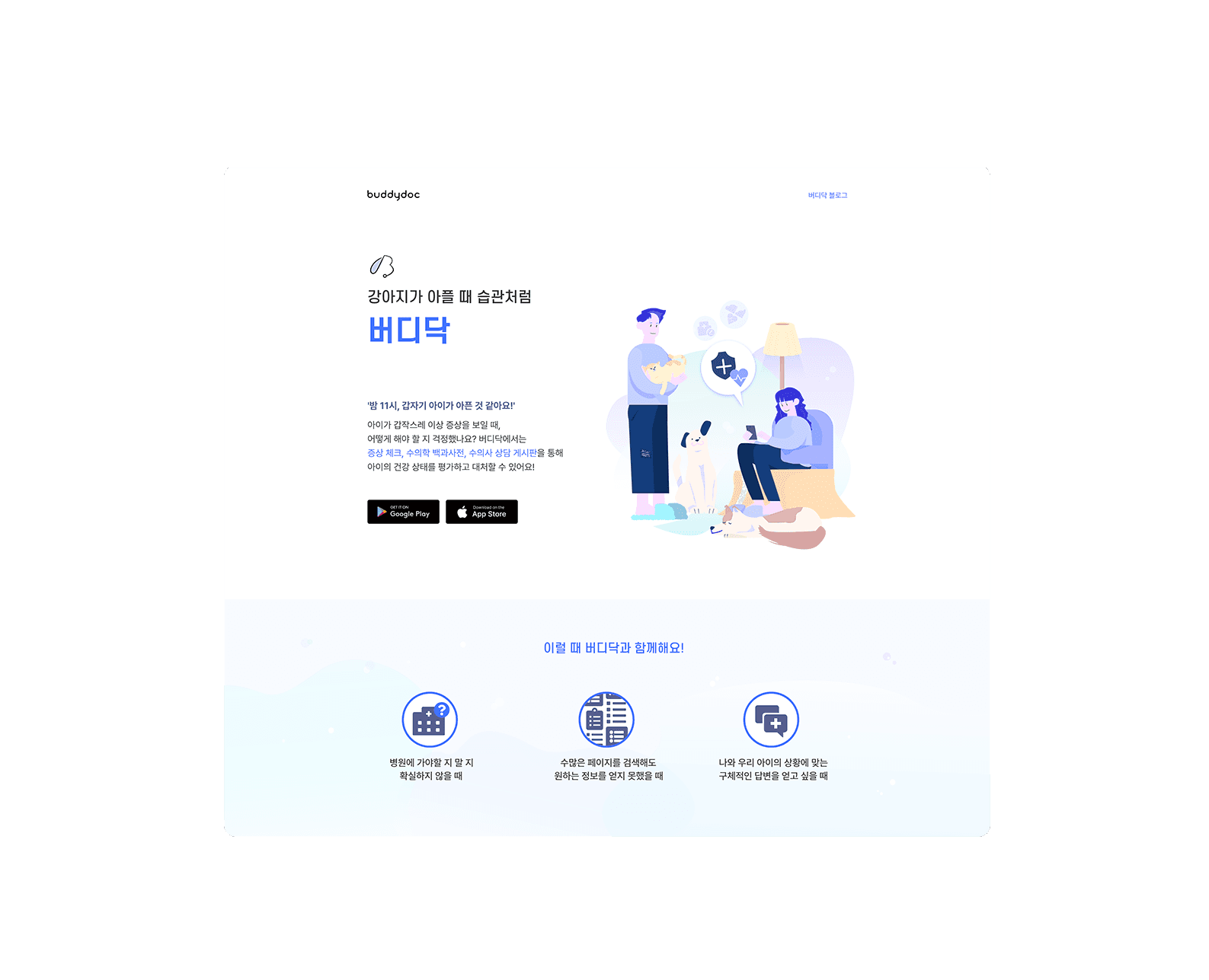
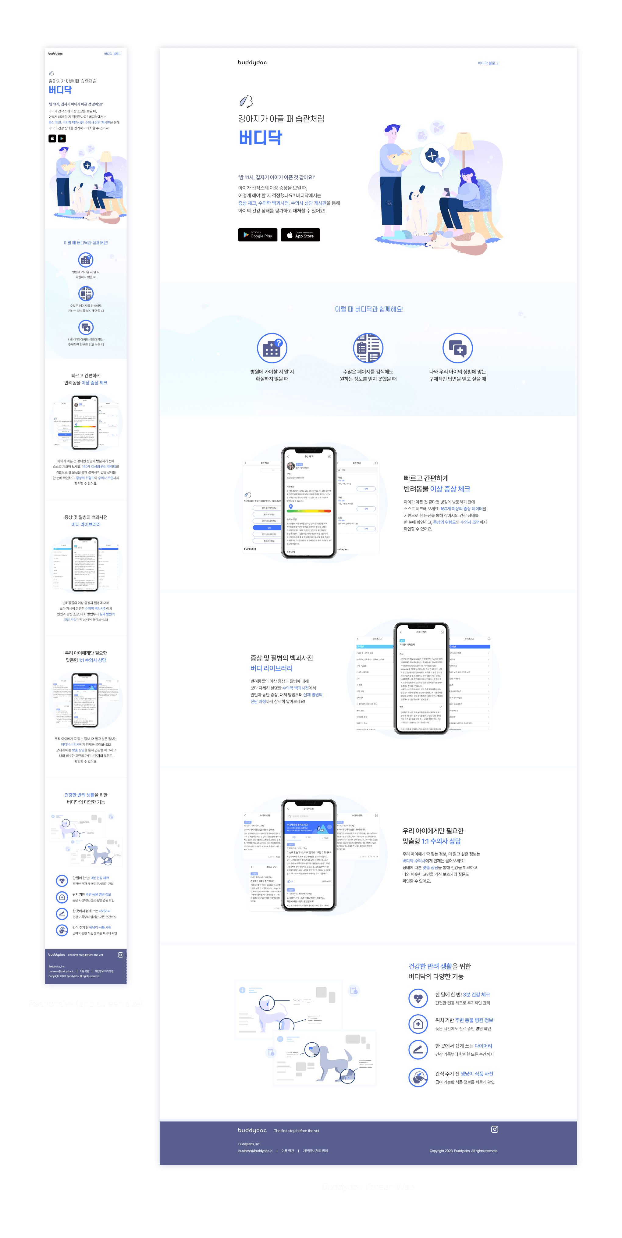
Buddydoc Korean app primarily uses blogs for community building within Korea, and there was already an active communication channel with users. So the website was intended to be concise, focusing on redirection from blogs and providing basic app introductions.
I was responsible for the graphic work on the Korean website and for making a key copy for each function collaboratively with the copywriter.
I've also designed the added features(symptom checker, general checkup) on the Buddydoc English website to create a flow from testing the features to eventually leading to installation.
Takeaways
✔ Executing Design-to-Development process
As a sole designer, I've experienced from the planning and organization stages to the execution of the design. completing the entire process of design from the initial stage to the final touch by myself and collaborating with developers has been a valuable experience.
During the development stage, I could see how the design was implemented and learned how to logically explain my design to our team. Through iterative revisions for a solid framework and design system, I was able to practice creating a structured design.
✔ Experience in design, marketing and copywriting
During my time at Buddydoc, I had the opportunity to engage in various tasks. I worked as a copywriter, translating terms for ASO, content, and in-app elements in both English and Korean. I also took on the role of a marketer, giving ideas for SEO and local advertising in South Korea.
And foremost as a designer, I collaborated with our team leader, shared opinions, and communicated with developers. Having diverse experiences beyond the scope of a designer has enhanced my collaborative skills and understanding of different tasks, enabling me to handle work more quickly and effectively.

